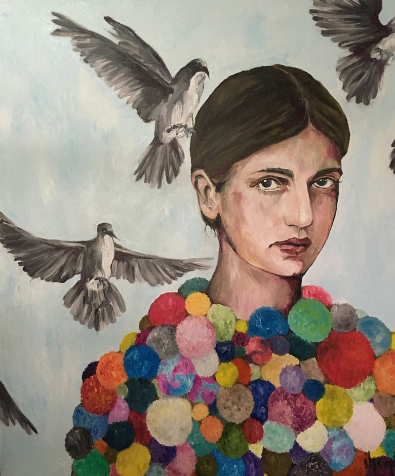
Looking at art · 6 min read
How to Look Closely at a Portrait
A practical guide to expression, gesture, framing, and the small decisions that give a painted figure its presence.
Read the guide ↗Looking · Making · Sharing
Practical ideas and slower ways of seeing. Twelve original guides for artists, collectors, and curious visitors.
Each guide develops a single subject in depth. The writing is new editorial content, clearly separate from the artist’s historical statements. Portfolio images illustrate the pages without implying that the artist authored the guides.
Looking at art · 6 min read
A practical guide to expression, gesture, framing, and the small decisions that give a painted figure its presence.
Read the guide ↗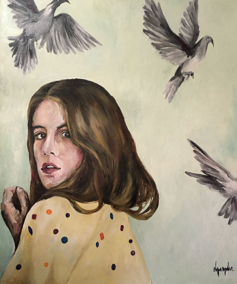
Painting · 6 min read
Explore how relationships between hues, values, and surrounding space shape an image without reducing color to a fixed emotional code.
Read the guide ↗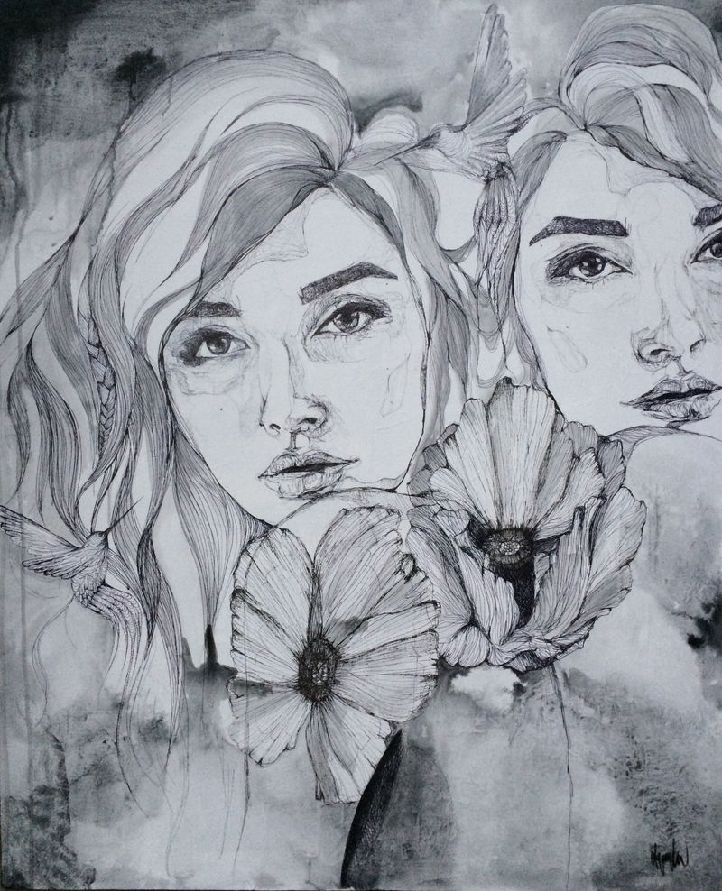
Visual language · 6 min read
A way to read natural motifs through their placement, scale, and documented context rather than a universal dictionary of symbols.
Read the guide ↗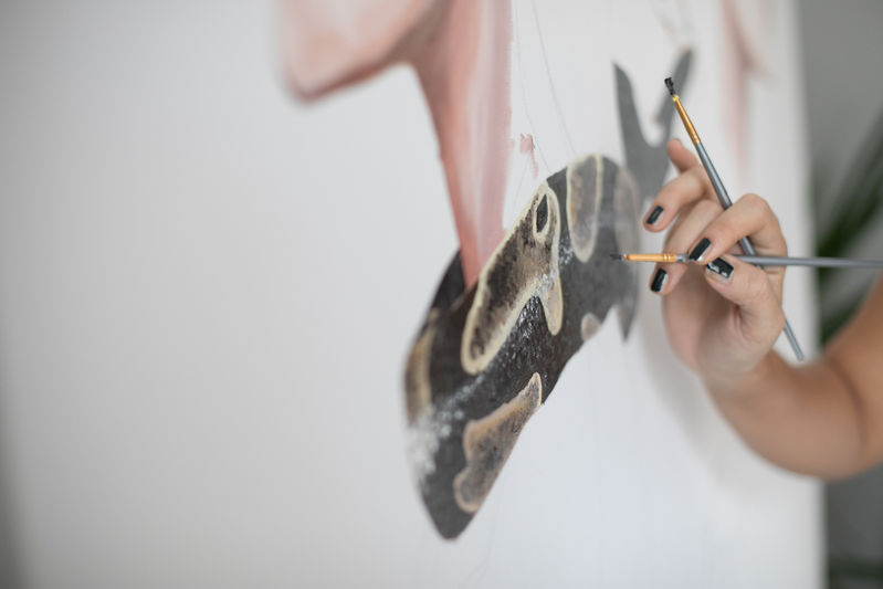
Studio practice · 6 min read
Build a drawing through proportion, negative space, changing edges, and useful revisions rather than a search for an instantly perfect line.
Read the guide ↗
Studio practice · 6 min read
Develop a series through a sustained question, purposeful variation, and editing that reveals relationships between individual pieces.
Read the guide ↗Materials & process · 6 min read
Bring drawing, paint, texture, and added elements into a composition where each material has a clear visual role.
Read the guide ↗Documentation · 6 min read
Plan consistent views, accurate captions, and useful details that help someone understand an artwork without standing in front of it.
Read the guide ↗Portfolio · 6 min read
Select, sequence, and caption work so that a visitor can understand both the individual pieces and the relationships between them.
Read the guide ↗Professional practice · 6 min read
A practical approach to writing about artistic decisions with clarity, concrete examples, and an honest sense of scope.
Read the guide ↗
Exhibitions · 6 min read
A considered guide to selecting work, sequencing a room, preparing labels, and documenting a small art exhibition.
Read the guide ↗
Professional practice · 6 min read
Questions that help an artist and a client discuss a commission, from the creative brief and reference images to documentation and delivery.
Read the guide ↗Collecting & care · 6 min read
A careful introduction to documenting and displaying works on paper, recognizing uncertainty, and knowing when to consult a conservator.
Read the guide ↗This guide offers a broader context for this archive page. It is new editorial writing, separate from the artist’s historical statements. You can also read the dedicated article.
A portfolio is an edited introduction, not necessarily a complete inventory. Begin by identifying its purpose. A general website, an exhibition proposal, an illustration inquiry, and a record of a past collection may need different selections. The audience should be able to understand why these particular works appear together without having to search through everything the artist has made.
Write a short description of the intended encounter. Perhaps you want visitors to notice a recurring relationship between figures and natural forms, or to understand how a series developed across several years. That purpose gives editing decisions a basis beyond personal attachment. A work can be strong and still be less useful for this particular selection. Keeping it in the archive rather than the opening sequence does not reduce its value.
The first few images establish the portfolio's visual language. Select works that communicate the direction clearly and invite another look. Avoid making the opening a competition between every dramatic piece in the collection. Contrast can be effective, but the viewer also needs enough continuity to understand what kind of conversation is beginning.
Consider the first pair as carefully as the first image. How does the second work change or extend the first? It might repeat a motif while shifting the palette, move from a full figure to a close portrait, or reveal a different handling of the same concern. A purposeful transition makes the sequence feel considered. An unrelated image inserted merely because it is another favorite can make the portfolio seem less coherent than the work itself.
When several bodies of work appear on one site, provide clear groupings and concise introductions. A visitor should be able to recognize when a collection begins, what period or question it concerns, and how it relates to the other groups. Use accurate dates when they are documented and avoid assigning a date solely from the image file's upload time.
Do not force every work into a category that suggests more certainty than the records support. A miscellaneous or earlier-work group can be appropriate when it is explained honestly. The point of organization is to help people look, not to manufacture a tidy history. Where a collection title comes from an original artist statement, preserve that context. New editorial labels should be distinguishable from titles the artist actually used.
Sequence can create movement through a portfolio. A dense image may benefit from a quieter neighbor; a large installation view can reset the sense of scale after several close details. At the same time, related works need enough proximity for comparison. Think about where the visitor should pause and where a transition should make the next image easier to see.
Test more than one order before deciding. A chronological sequence may explain development, while a thematic sequence may make formal relationships clearer. Neither method is automatically correct for every purpose. View the selection without reading your own captions and ask whether its visual logic remains legible. Then add the information back and check whether the text strengthens that logic rather than compensating for a sequence that does not quite work.
A caption should identify the work and provide the facts a viewer needs. Depending on the available record, that may include title, date, materials, dimensions, and photographic credit. Keep the format consistent so that the reader does not have to learn a new system for each image. If a detail is unknown, do not invent it to make the caption look complete.
Distinguish a historical availability note from current sales information. An archived label saying sold describes the record in which it appeared; it does not necessarily establish the present location of the object. Similarly, a commission reference can identify the context of a work without implying that the same service is currently available. Accurate captions protect the portfolio from making unintended promises while giving a viewer a reliable foundation for further questions.
The website's visual system should make the work easy to encounter. Provide comfortable spacing, readable text, consistent controls, and a way to enlarge an image without losing its caption. Decorative movement and complicated transitions can draw attention away from a painting's own rhythm. Use restraint where the artwork already contains visual complexity.
Check the experience on narrow screens. A layout that looks balanced on a desktop can crop a work awkwardly or make a caption difficult to associate with its image on a phone. Preserve the complete artwork when presenting a documentary view. If a promotional crop is used elsewhere, let the visitor reach an uncropped image easily. Good presentation gives people control over the encounter instead of deciding that one dramatic framing must serve every purpose.
An artist's website may contain old exhibitions, earlier collections, press references, and contact information from different periods. Label those records clearly. A past show should not look like a current event, and a preserved contact detail should not become an unqualified promise of an active service. The distinction is particularly important when a site has been restored from incomplete files.
A complete archive can coexist with a focused portfolio. Let the main navigation lead to the most useful selections while providing a directory for deeper exploration. Repeated or supplementary routes need not all become independent search destinations. The editorial priority is an understandable structure: a visitor should know whether they are seeing selected work, a historical record, or new writing about artistic practice.
Before publication, consider what happens if you remove each piece in turn. Does the selection lose an important idea, a necessary transition, or simply another example of something already clear? This exercise can reveal redundancy without requiring you to judge the work as inferior. A shorter sequence may allow the remaining pieces to receive more attention.
Return to the portfolio periodically with its purpose in mind. Correct captions, repair links, and update the selection when the work or audience changes. Preserve earlier records where they have historical value rather than silently rewriting every date and description. A thoughtful portfolio is both selective and accountable: it presents a clear point of view while allowing a visitor to understand the evidence, boundaries, and editorial choices behind the presentation.