Think in relationships rather than labels
Color becomes expressive through its relationships. A red passage can appear warm, distant, quiet, or insistent depending on its size, saturation, neighbors, and place in the image. Describing red as passionate or blue as calm may offer a starting association, but it does not explain how a particular painting works. Look at what the color is doing rather than assigning it a permanent emotional meaning.
Choose one passage and compare it with the areas touching it. Notice whether it is lighter, darker, more intense, or more neutral. Then compare it with a similar color elsewhere in the work. The same hue can behave differently across a composition because the surrounding conditions change. This relational approach gives you a more useful vocabulary for discussing atmosphere and helps prevent a painting from being reduced to a chart of familiar associations.
Separate hue from light and dark
Hue describes a family of colors, while value concerns relative lightness and darkness. A painting can contain many hues within a narrow value range, or very few hues with a strong contrast between light and dark. These choices affect how quickly the image reads and where attention gathers. Squinting slightly can help you notice broad value groupings without becoming absorbed in smaller details.
Look for the lightest and darkest areas. Ask whether they meet near the focal point or are distributed across the surface. A pale face emerging from a dark field creates a different rhythm from a figure built out of closely related middle values. Neither arrangement is automatically more dramatic or more subtle. The effect depends on scale, edges, and context. Describe the pattern first, then consider how it contributes to the feeling you experience.
Notice the work done by quieter colors
Muted passages often make stronger colors possible. An area that initially appears gray or brown may contain small shifts that establish depth, temperature, or a pause in the composition. Give those passages the same attention you give the brightest detail. They may connect otherwise separate parts of the image and prevent an accent from looking merely attached to the surface.
If you are making a painting, compare a saturated mark against several quieter grounds before deciding where it belongs. Observe how the mark changes without changing the paint itself. This simple exercise demonstrates why choosing colors individually is different from building a palette. A collection of attractive swatches does not automatically produce a coherent image. The spaces between the accents, and the colors that support them, help determine whether the whole composition can sustain attention.
Consider temperature as a local effect
Warm and cool are useful comparative terms, but they are not absolute descriptions of every color in every setting. A blue can appear warmer beside another blue, and a neutral can shift noticeably when surrounded by orange or violet. Look for changes within a color family rather than dividing the entire painting into two fixed groups.
Temperature relationships can separate planes, connect distant passages, or complicate an otherwise simple light-dark structure. Ask where those shifts occur and whether they correspond to the subject's form. An unexpected cool passage in a face may work as a compositional choice rather than a literal record of natural light. In expressive painting, the artist can depart from observation deliberately. The useful question is how that departure interacts with the rest of the image, not whether the color matches an isolated expectation.
Follow the size and spacing of accents
A small intense shape can influence a large quiet field. Its effect depends partly on how much visual space it occupies and how often a related color appears elsewhere. One isolated accent can feel abrupt or precious; several repeated accents can establish a route for the eye. Track that route before deciding which color dominates the painting.
Notice whether repetitions are exact or varied. A bright flower may be echoed by a much smaller mark in clothing or by a softened passage in the background. Those echoes can make separate elements feel connected without making the design symmetrical. When every accent is equally strong, the viewer may have difficulty knowing where to rest. Unequal emphasis often gives the image a clearer rhythm, allowing one passage to lead and others to answer more quietly.
Let material complicate the palette
The appearance of color is affected by surface, opacity, texture, and light. A thin transparent layer does not behave like a thick opaque one, even when the general hue seems similar. Metallic additions can change as the viewer moves, while a matte passage can hold a steadier appearance. A photograph may flatten those differences into a single impression.
Use the medium listed in the caption as a boundary for what you can claim. If the source identifies ink, watercolor, acrylic, or gold leaf, consider how those materials may contribute to the visible effect. If the information is absent, describe the appearance without assigning a process. A dark passage that looks transparent in a reproduction may be affected by the photograph. Distinguishing observation from material identification keeps your account accurate while still allowing a thoughtful response to the image.
Test a palette with a limited study
For practical exploration, make several small studies of the same simple arrangement. Keep the shapes similar while changing one color relationship at a time. You might vary the background value, reduce the saturation of most passages, or move a single accent. Small studies make comparison easier because each change can be connected to a specific decision rather than several simultaneous revisions.
Record what changed in your response. Did the figure seem closer, did the background become more active, or did an object lose its importance? Avoid judging every study as a success or failure immediately. An awkward version can reveal a relationship you had not understood. Keep the examples together and review them after a break. Distance from the making process can help you notice effects that were obscured while you were concentrating on mixing and placement.
Describe mood with evidence
When discussing a painting's mood, combine an emotional term with an observation. Instead of saying only that an image feels unsettled, explain that small intense accents interrupt a broad quiet background or that the value structure pulls attention in competing directions. Another viewer may experience the same arrangement differently, but your description gives them something concrete to consider.
Color is most interesting when it remains part of the whole work. Shape, gesture, texture, scale, and subject all contribute to atmosphere. Return to the complete image after examining individual passages, and ask whether your understanding has become more specific. The goal is not to eliminate personal response. It is to support that response with careful looking, so that a statement about mood becomes an invitation to see more rather than a label that ends the conversation.
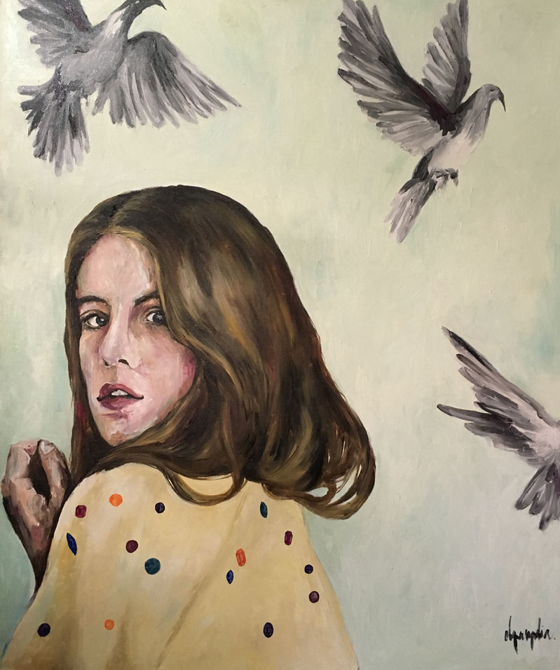
Illustration: Secretos from the original art archive. This editorial guide is not presented as a new statement by the artist.